When I started working in digital graphic design, one of my learning methods was to reproduce the work of my favorite artists. Not only is this a great way to learn design techniques and technical skills, but it also gives you a feel for how the artists thought about and constructed their work. All of the artwork shown on this page was reproduced using Adobe Illustrator and Photoshop from the artists’ original work.
Otis and Dorothy Shepard were the original ad-man and ad-woman design powerhouse of the 1930s. This dynamic duo brought a uniquely American aesthetic to European modernism while reshaping design and advertising norms. During the 1930s, they were responsible for developing a holistic design aesthetic for Catalina Island under the sponsorship of PK Wrigley.
Designer Otis Shepard, or Shep as he was called, was born in 1894 in Smallville, Kansas. He left home at age 12, when he traveled to El Paso, Texas, to find work as an errand boy at an engraver’s shop. The young nomad continued to California to live with an uncle who owned a vineyard in Napa Valley – but the life of a vintner wasn’t for him. He relocated to San Francisco less than a year later, where he found work drawing cartoons for the San Francisco Tribune under the guidance of Bud Fisher of Mutt & Jeff cartoon fame. At some point shortly after that, he apprenticed with an area lithographer and, by 1912, was able to hang out a shingle of his own. He signed on with the outdoor advertising firm Foster & Kleiser in 1917, where he spent a year before heading off to war.

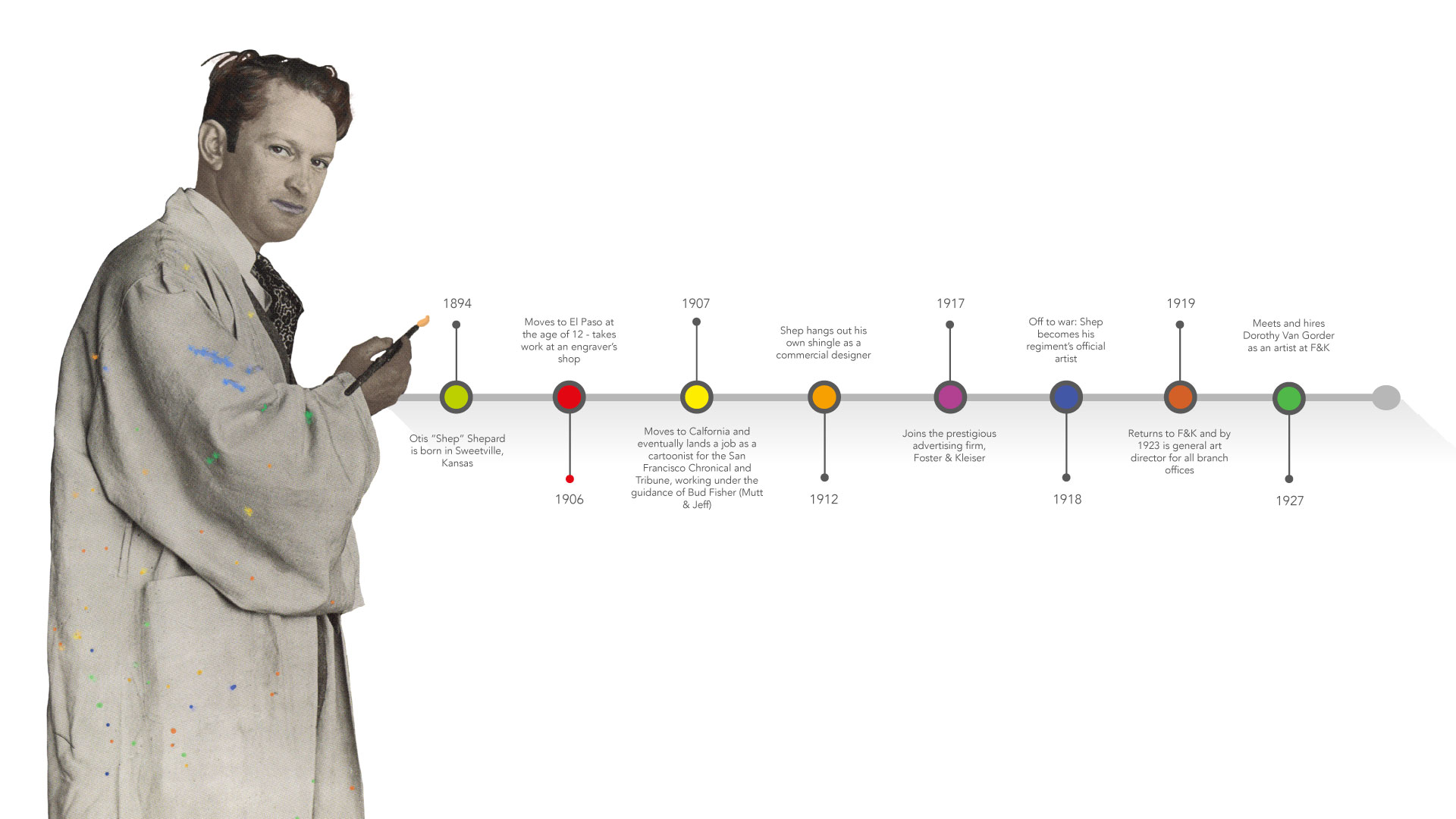
Shep quickly became his regiment’s official artist, visualizing aerial field surveys and capturing scenes of daily life. By the war’s end in 1919, he returned to his position at Foster & Kleiser, rapidly moving up the ranks to take over as general art director for the firm. Looking for another talent, Shep is introduced to Dorothy van Gorder and hires her.
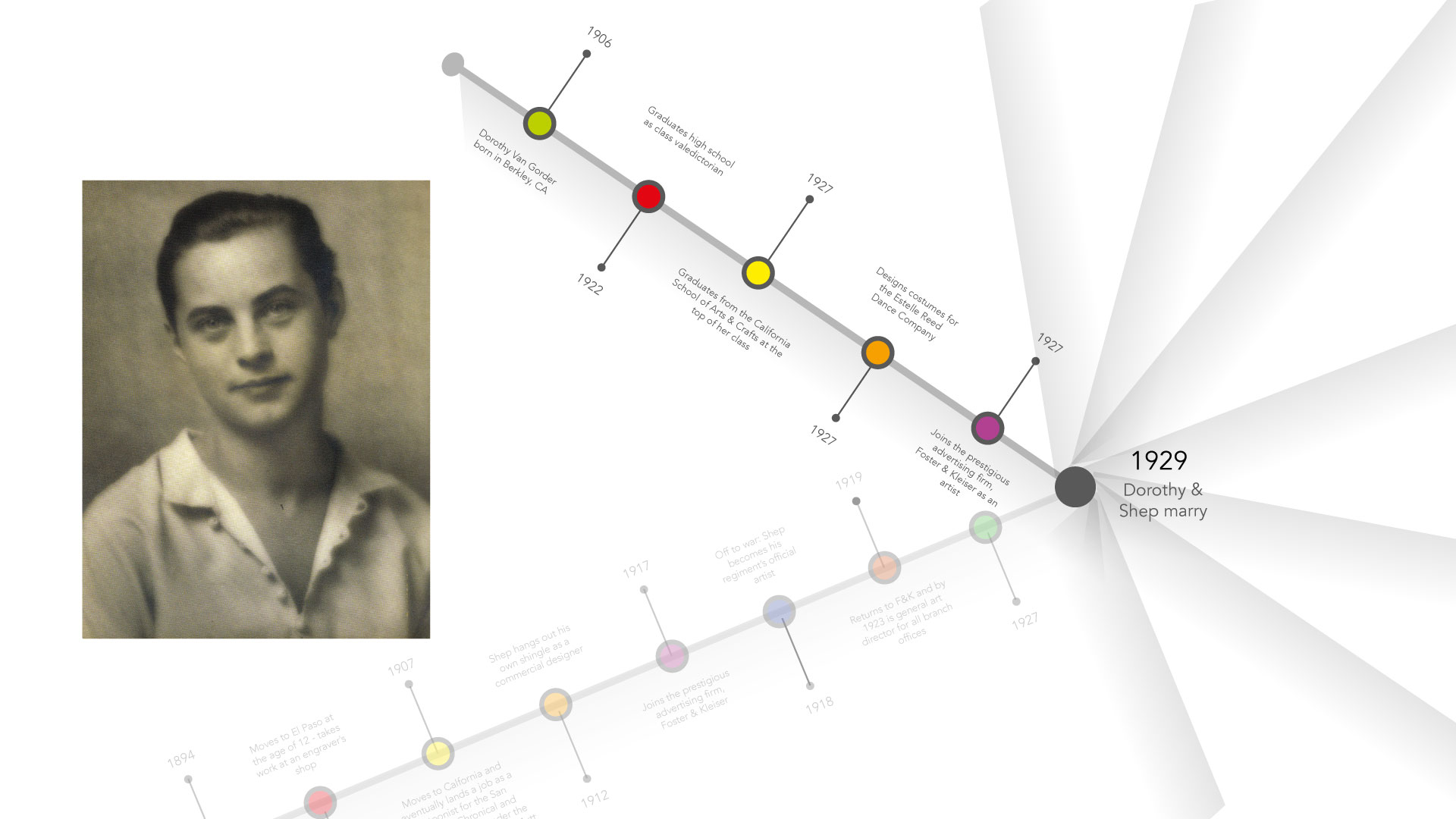
Dorothy Van Gorder was born in 1906 in Berkeley, California. Somewhat of a prodigy and Bohemian free spirit, she graduates from high school as valedictorian at age 16. She continued to the California School of Arts & Crafts, graduating (again as valedictorian) in 1927. After a year of designing costumes for a well-known avant-garde dance troupe, she meets Shep and lands a position at Foster & Kleiser. Foster & Kleiser was founded in 1901 and specialized in outdoor billboards and building advertising. With the passing of the Federal Highway Act in 1921, which increased national spending on roads, there was a boom in the automobile industry. To quote, “outdoor advertising became the broadcasting system of its time.” Because of their prominent position as outdoor advertisers, Foster & Kleiser monopolized roadside billboards.
Shep and Dorothy honeymooned in Europe, taking the time to meet the renowned modernist designer Joseph Binder. Binder was known for stylistic elements in his designs, particularly the reduction of images into shapes, airbrushing – which gave the artwork luminescence – and the integration of typographic elements. The pair were enamored by modern design and invigorated by their trip to Europe, bringing the design aesthetic back to their US practice. For Shep, this represented a shift from “painterly realism” (Hathaway & Nadel, 2014) to a distinctly modern style. Inspired by Binder, Shep became one of the first US designers to use the airbrush as his primary tool.
“I am interested in symbolism. The artist who works in the modern style works in symbols of one kind or another, either intellectual, such as words and phrases; literalistic, representations of the photographic kind; or subconscious symbols, getting his effect through an appeal to to certain mental reactions without the realization of the onlooker.
The modern approach differs from the traditional method in that it makes greater use of the latter kinds of symbols. Certain combinations of line and color that speak an almost primitive language, which express dramatic action and appeal to the intuitive emotions – these are the materials used in the symbolic methods today.”
In this quote from a 1929 interview, Shep talks about his interest in symbolism which heavily influences not only his but Dorothy’s work. Throughout his extensive design career, he rarely strays from this modern symbolic style.
PK Wrigley
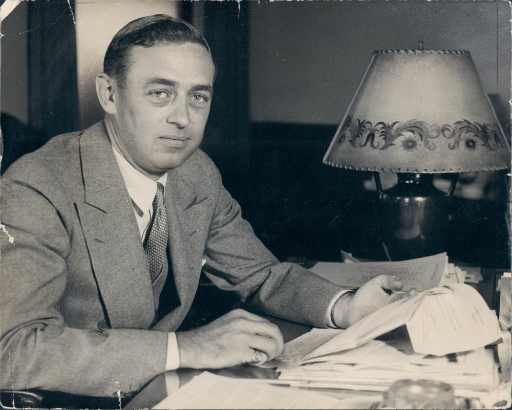
By the early 1930s, the Shepards were widely considered at the top of their field in American ad design. The couple started independently and continued to produce billboards for big brand companies. In 1932, Shep met with PK Wrigley, owner of the Wrigley chewing gum empire, to show him some designs. Wrigley was so impressed with the work that he hired Shep. It was a partnership that would last throughout Shep’s life. Shep designed everything around the Wrigley brand, including the gum wrappers, matchbooks, outdoor advertising, pamphlets, and counter displays – if it said Wrigley on it, Shep designed it.
Shep’s guideline for successful advertising was that the audience should understand the meaning of the ad in less than five seconds. Across all of these advertising pieces, we see the consistent application of his key themes: flat color, airbrushing, and minimal text – which he used to argue with PK Wrigley about. But sales were soaring thanks mainly to the Shep-designed advertising campaigns, and Wrigley mostly let him have his way. Shep introduced the Doublemint twins in 1939, an advertising theme that has endured to the modern day. Shepard’s package design for Doublemint gum remained unchanged until 2002.

The Shepards on Catalina
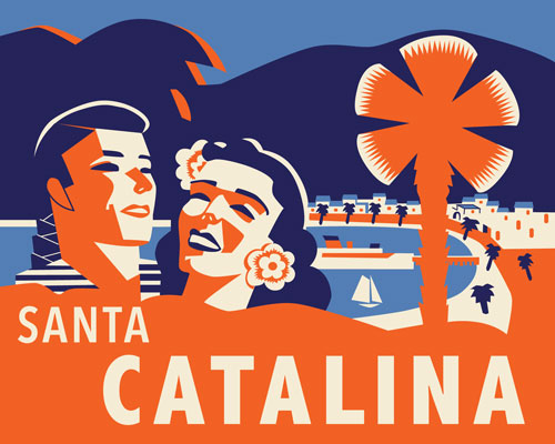
In 1932, upon his father’s death, William Wrigley, PK inherited the beautiful island of Santa Catalina, as the song says, just a 26-mile boat ride from Los Angeles. His father’s goal was to create a resort paradise. One of the first things PK did was hire Shep, who took on the responsibility of creating a vision to promote tourism on the island. Dorothy and Shep lived on the island for four years, and the pair not only created promotional print materials, such as the brochure covers, luggage labels, and matchbook covers you see in these photos, but also landscaping for resort properties, road signs, and uniforms for employees. One of Shep’s objectives was to unify design and create a graphic identity for the island, a style he called the “Early California Plan” (Hathaway & Nadel, 2014) – a blend of the popular 1920s and 30s California Revival style, which was heavily influenced by Spanish, Mexican and Native American influences, and his modernist ideals. A bright color palette of blues, reds, oranges, and yellows dominated his interpretation of this design style. If you compare the Catalina work with the Wrigley Gum advertising, you’ll notice that consistent modernist design theme, with all the warmth of the California sunshine.


Recommended reading:
Hathaway, N. & Nadel, D. (2014). Dorothy and Otis: Designing the American Dream. New York, NY: Harper Design


